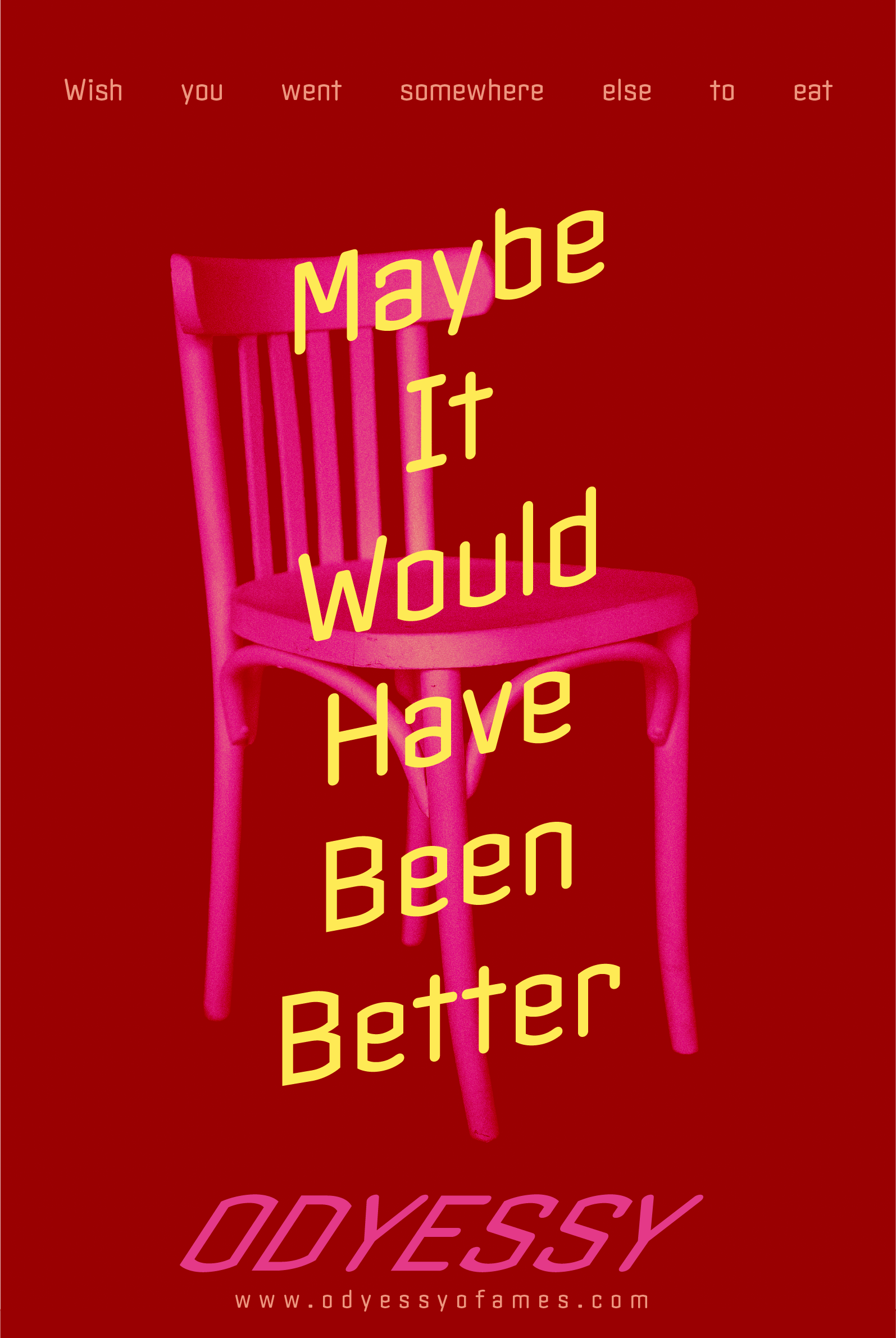
Based on our website we then had to make advertisements for our website. I started looking at modern advertisements and got overwhelmed by all the colors and all the words and messages. I then pivoted and started looking at the 1940s-1950s Swiss and Bauhaus design and got really inspired by its design. I was made my design abstract and vague, almost mysterious because I thought that the people who would be willing to look up the website from the poster then they would probably be the person who would be willing to try new things. I also wanted the posters to be hung up one right after another as a series so it would be more effective.


